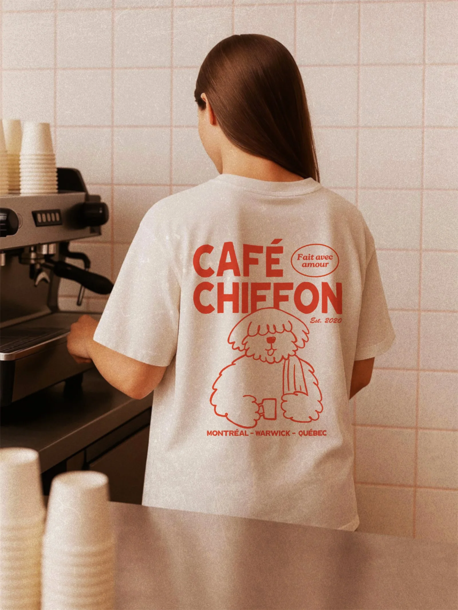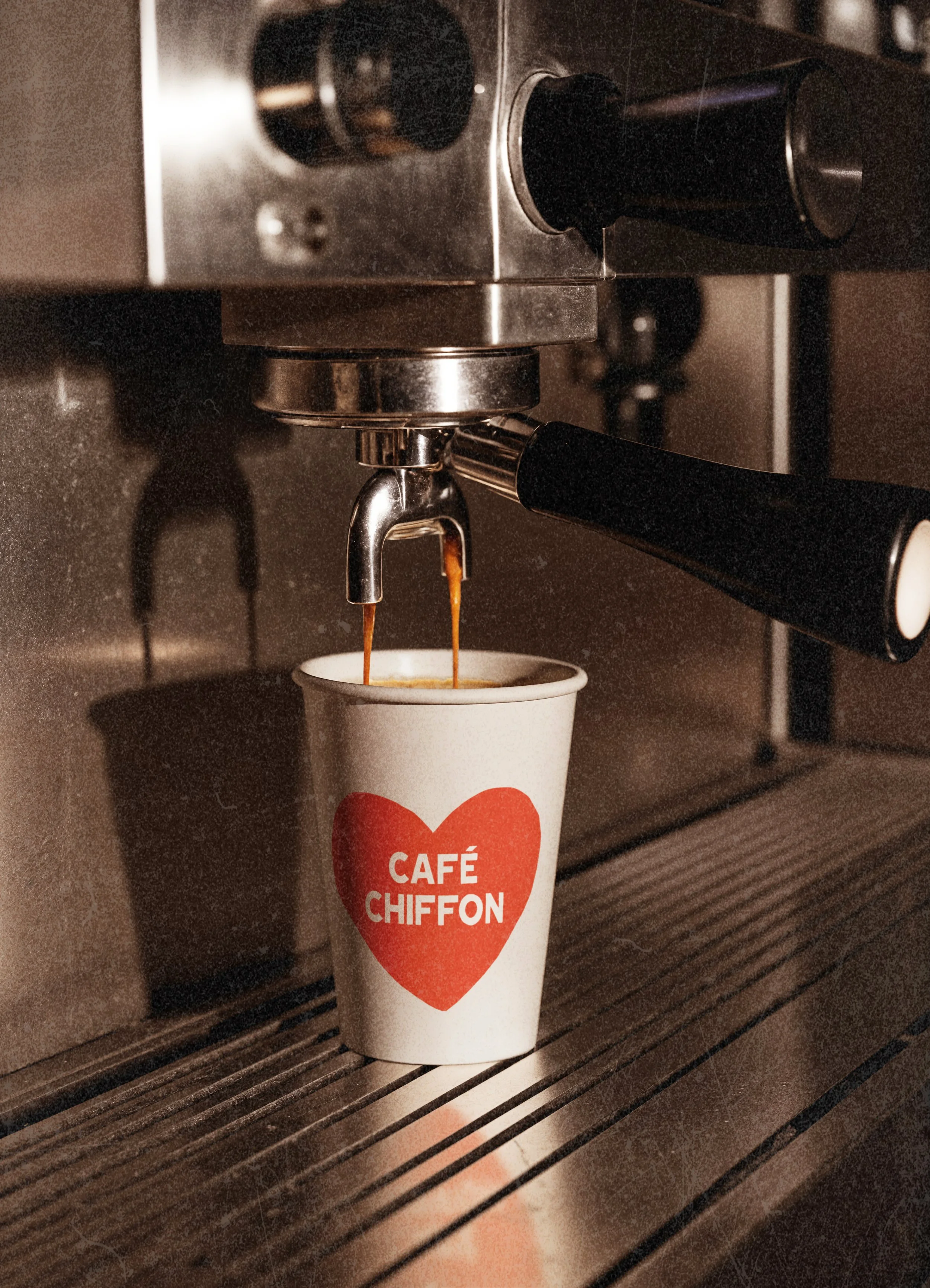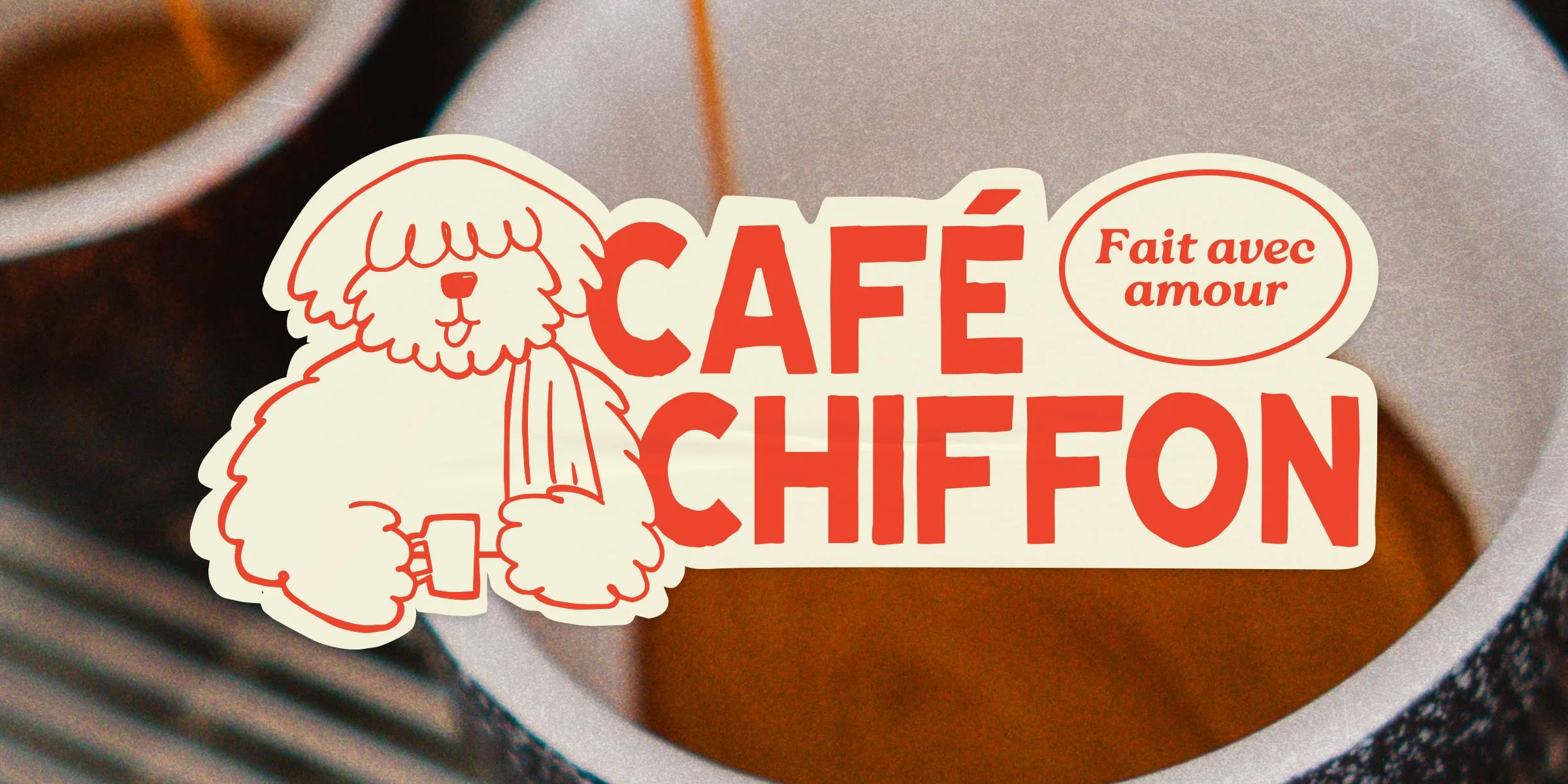
Cafe
Chiffon
MTL cafe— logo visual rebrand.
Cafe Chiffon
Cafe Chiffon was an exercise in balance: building a café brand that could feel soft, expressive and quirky while still carrying real presence.
The name naturally suggested something light and airy, but the challenge was making sure the identity didn’t drift too far into surface level sweetness.
We wanted it to feel warm, distinctive, and full of personality, while still grounded enough to feel cohesive and believable. That tension shaped the entire brand, from the visual language to the weighted font choice.
What emerged was a study in contrast: softness with structure, playfulness with intention. The result is a brand world that feels fresh and inviting, but still holds its weight.